Top Interior Paint Colour Trends You’ll Love This Year
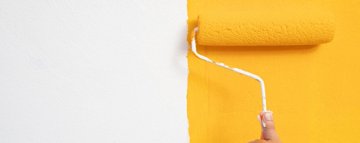
Table Of Content
- Introduction
- Brown – Deep, Warm, and Natural
- Purple – Bold Yet Subtle
- Green – Luxe, Peaceful, and Infinite
- Red – Rich and Dramatic
- Pink – Warm, Muted, and Cozy
- Yellow – Bright and Cheerful
- Blue – Soft, Dusky, and Airy
- Mixing and Matching Trends
- Final Thoughts
Top Interior Paint Colour Trends You’ll Love This Year
The new year brings fresh colour trends in interior design. Paint colours help set the tone and mood in your space. In 2025, rich, warm, and earthy shades are taking the spotlight. These colours bring comfort, depth, and a sense of calm. Some shades bring bold energy, while others create peaceful retreats.
Let’s find the top paint colour trends this year. Each trend comes with its character and effect on your space. You’ll also find the advantages, disadvantages, and ideal uses.
Brown – Deep, Warm, and Natural
Brown has emerged as one of the most popular choices for interiors. Individuals now prefer it to grey due to its earthy, grounding quality. Brown makes them think of earth, wood, and nature. It provides an intense feeling of calmness and security.
This year, look forward to deep chocolate, caramel, and rich muddy brown shades. Some variants have pink or red undertones, which lend the colour warmth and hospitality.
Advantages of brown: Brown will give a space warmth and solidity. Brown looks great on wood and stone, two very natural materials. It suits warm light and brings equilibrium to dramatic or subtle accents.
Best applications: Use brown in living rooms, bedrooms, or offices to establish warm rooms. It can be applied on feature walls or for complete coverage. Use it with lighter warm tones to add contrast. It can also complement golds, creams, or subdued greens.
Drawbacks: Excessive dark brown may weigh in on tiny or poorly lit rooms. Use lighter shades or create contrast through trims or soft furnishings.
Purple – Bold Yet Subtle
Purple this year leans into soft plum and brown blends. It feels luxurious but not overpowering. It gives depth without being too bold or bright.
A popular example mixes muted plum with velvety brown. This creates a soft and elegant feel. It doesn’t demand attention but adds richness to the room.
Advantages of purple: Purple is calming and creative. It is suitable for reading rooms, bedrooms, and art rooms. It produces a warm mood without being gloomy.
The best application: Pair it with pale greens, greys, or pale pinkish hues. It goes well with neutral floors and wood furniture.
Drawbacks: Overuse can be moody in small spaces. Use sparingly in north-facing spaces where there is not much light. Introduce warm lighting to mellow its tone.
Green – Luxe, Peaceful, and Infinite
Green stays robust in 2025. Forest green, olive, and moss colours dominate. These colours feel earthy, ageless, and near nature. Jewel greens such as emeralds occur more in accents.
Deep greens provide a rich and opulent ambience. Lighter shades provide a natural and earthy atmosphere.
Advantages of green: Green enhances concentration and relaxation. It is well-suited for every type of room, from the kitchen to the bedroom. It combines stunningly with warm wood and metallic accents.
Ideal applications: Apply dark green to ceilings with white walls and trims. Incorporate house plants to complete the appearance. Olive greens are ideal for minimalist and bohemian rooms.
Disadvantages: Strong greens may make small rooms feel smaller. Counterbalance with light-coloured furniture or accessories.
Red – Rich and Dramatic
Burgundy and deep red are having a big comeback. It gives depth and luxury. It's dramatic but also timeless. It's ideal for someone who desires a statement appearance.
This colour suits dining rooms or focal points. It can warm a room with sophistication.
Advantages of red: Red provides a dynamic and hot feel. It is suitable for traditional and contemporary rooms. It is complemented by natural wood, navy, and cream.
Ideal uses: Apply on a single wall or in smaller quantities, such as furniture or trim. Red adds life to chilly rooms and provides history and personality.
Drawbacks: Room-sized red can be overwhelming. Balance it out with neutral colours or soft textures.
Pink – Warm, Muted, and Cozy
The pink in 2025 is warmer and softer. It tends to have peach or brown undertones. These colours are natural and inviting. They don't come across as bold or sugary like previous pinks.
Muted pinks are suitable for most spaces. They provide a mature and soft appearance that transitions well with other earthy colours.
Advantages of pink: Pink evokes a serene and soothing atmosphere. It performs well in bedrooms, lounges, and even corridors. It suits all forms of lighting.
Ideal applications: Use it with stone colours, browns, and pale woods. Apply it to full walls or as an accent on trims and ceilings.
Drawbacks: Pink is too soft or feminine for some individuals. Select shades with brown or peach undertones for a more earthy appearance.
Yellow – Bright and Cheerful
Yellow introduces energy and brightness. Bold and sunny yellows are trendy in 2025. Such colours add life and optimism to an environment.
Bright yellows are suitable for spaces where you need an energy boost. Use them to accentuate details or lighten dark areas.
Advantages of Yellow: Yellow is uplifting and adds playfulness. Yellow is ideal in kitchens, hallways, or in creative environments.
Best uses: Apply it as an accent on doorways, windows, or furniture. Provides contrast to dark or neutral walls. Pair it with pale grey or white for equilibrium.
Drawbacks: Yellow can be harsh or overbearing in excess. In large quantities, it might become monotonous with time. Use it with caution and contrast.
Blue – Soft, Dusky, and Airy
Light dusky blue is a relief from all the warm shades. It comes across as cool and clean. These blues frequently have grey or green undertones. This gives them a softness and ease of use.
For north-facing rooms with cold aspects, use blues that have a trace of green in them. This prevents the area from being cold.
Advantages of blue: Blue relaxes the mind and aids concentration. It is appropriate for studios, bedrooms, and bathrooms. It provides a feeling of airiness and openness.
Best applications: Combine dusky blue with whites, greys, and pale wood. Apply it to lighten darker rooms without being overpowering.
Drawbacks: Certain cool blues may be cold. Introduce warm accents such as wood, brass, or soft fabrics to counteract it.
Mixing and Matching Trends
You can combine these colours throughout your house. Apply brown to the living room, green to the kitchen, and pink to the bedroom. Use yellow or red for decorations.
Experiment with colour drenching to paint walls, trim, and ceilings in the same hue. Creating a cocooning effect is especially easy with warm browns, pinks, or greens.
If you desire contrast, match deep colours with lighter versions in the same colour family. Add layers and interest with soft furnishings, rugs, and artwork.
Final Thoughts
This year's colour trends welcome warmth, depth, and cosiness into the home. Whether you desire bold drama or gentle calm, there is a colour for you. Every colour has something to offer. Consider the light in your space, the mood you wish to create, and your sense of style.
Paint is a potent weapon. It changes rooms, influences feelings, and captures personality. Select colours that bring you joy. Follow trends, but only when they suit your style. Make 2025 the year that your home becomes more you. Once you've picked the perfect colour, don’t hesitate to hire a painter or decorator to bring your vision to life with precision and the right tools. A professional job ensures that your chosen shade truly shines.
YOU MIGHT ALSO BE INTERESTED IN
Capital Cities
- Decorator Services in St Helier
- Decorator Services in Nottingham
- Decorator Services in Cambridge
- Decorator Services in Isle of Man
- Decorator Services in London
- Decorator Services in Newcastle upon Tyne
- Decorator Services in Manchester
- Decorator Services in Belfast
- Decorator Services in Edinburgh
- Decorator Services in Guildford
- Decorator Services in Bristol
- Decorator Services in Cardiff
- Decorator Services in Birmingham
- Decorator Services in Leeds


